For the rest of September, my favorite scrapbook site (www.myscrapbooknook.com) is having a really fun challenge called "Nook University." All the challenges are school related. You'll see what I mean when I show the three layouts I made for this week.
------------------------------------------------------------
This one was for "Math" class. The challenge was to have lots of multiples of three.
Doing threes was easy but having 6,9, or more was difficult. So I have:
9 materials:
Fiskars Kimberly Poloson Patterned paper
Prima ivory felt ribbon
Quickutz Paige and Paige mini alphabets
Stampin' Up Scallop Circle Punch
Making Memories Journaling Pages
Antique brads by Buttons Galore
Tim Holtz distress ink - antique linen
Corner Rounder
Misc. Ribbon
3 photos, 3 patterned paper, 6 brads, 3 scallop circles, 6 scallop edges total, 9 inches felt ribbon, 33 cm brown ribbon, 9 cm teal ribbon, 3 ribbons total, and 15 QK die-cut letters
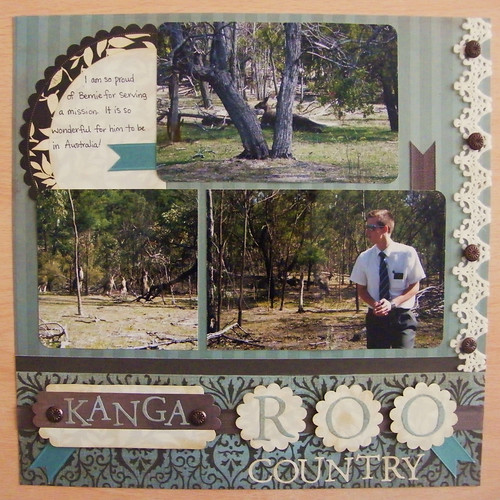
This is my brother. He's in Australia right now, if you can't guess.
------------------------------------------------------------
The next LO I did for "Intro to Art." The challenge was to choose a choose a piece of artwork and use it to inspire a LO.
I LOVE art nouveau.
I chose Alphonse Mucha's 'Moon.'


I just want to show these other two, because they show the curved lines and circles typical to art nouveau.
So here's my attempt at an art nouveau layout:

Materials:
Tinkering Ink patterned papers
Inque boutique chipboard - 'Bee' and swirls
American Crafts thickers - 'bumble'
blue/purple cardstock
SU Scallop punch (punched twice to make the smaller scallops/spikey circles)
1.5" circle punch
Purple and dark blue inkpads
------------------------------------------------------------
And my last LO for this week was for "English" class. The challenge was to make a LO about reading, including a photo of myself reading a book and at least 50 words of journaling.

Please forgive the night-time photo. (It makes the photo have glare - it looks like scratches.)
Journaling reads:
"I love reading. As I was growing up there were always books in our house.
When my sister, Leah, was in first grade, she loved reading so much she tried to teach me at age 2! I didn't take to it then, but her love of reading has definitely influenced mine.
I was a big reader in school and even now I'm always on the lookout for a new author or series.
Here I'm reading one recommended by Leah: Stephanie Meyer's Twilight.
September 2008"
Materials:
Prima papers, and flowers ('Tea & Silk')
Prima journaling sheets ('whisper')
Imaginisce Crystals (inked black with Sta-On)
crystal brads
May Arts black ribbon
twined thread ribbon
Studio g alphabet stamps
4 comments:
I think the night-time photo gives it a bit of character. It seems to create greater contrasts and actually makes the photo more interesting. That, along with the "scratches" give it kind of a nostalgic quality.
I think each of these layouts are fantastic, but my fav one is the Kangaroo one...the picture placement and the colors and designs are just perfect. Thanks for sharing!
I just came across your blog today from ILWS. You have some gorgeous layouts, I especially like the colours and ayout of the Bumble Bee page.
Fantastic work!
TFS
Michelle
I love the kangaroo lay out, my brother in law was in the adelaide australia mission two years ago he loved it there.
Post a Comment